I created a comic book cover for the song, Carnival of Life by my current favorite singer, Von Smith. I love the way he can sing so charmingly creepy. I based my comic cover mostly on this segment of the song, focusing on the, "Moments meant to bend your mind"
In this carnival of life
There's so many rides to ride
Moments meant to bend your mind
Doesn't anybody want to go?
Oh, don't be so serious!
Lighten up! Have a laugh! Have a heart!
So don't be so serious!
And you just might like who you are
Sure, things can go wrong,
but they can still go right
If ya keep on keepin’ on
you can make it through the night
Cause we all belong in this carnival of life
So lighten up! Have a laugh! Have a heart!

Brainstorming and Layout Sketches
I started by writing down key phrases from the song, and then making thumbnail sketches that illustrate different phrases. I went with the swirling Von Design that encapsulates the mind-bending description.

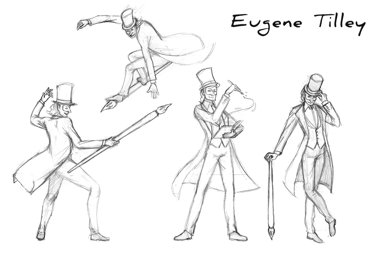
Pencil Sketch
I started the sketch by tracing over the thumbnail I printed blown up to size.

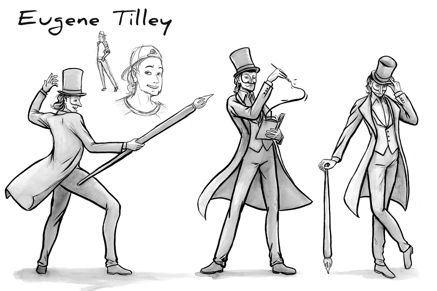
Traditionally Inked
I added Von’s arms. His normal sized hands on this stretched on body made it more creepy.

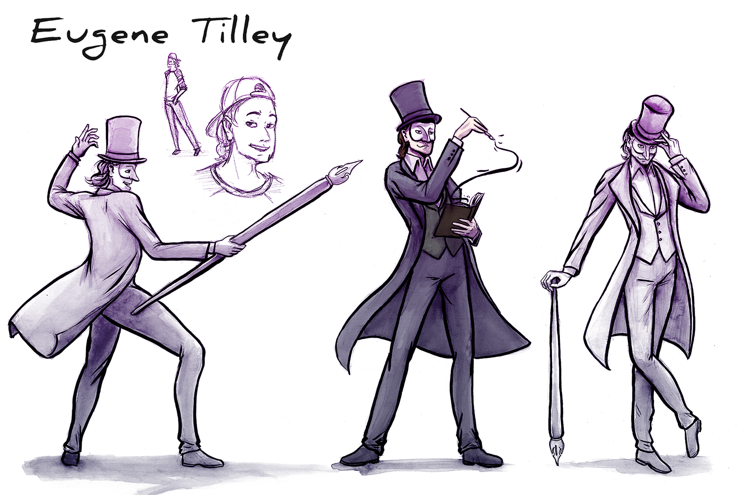
First Test
I wanted a wrinkly paper bag texture and a contrasting color scheme of purple and yellow. I looked at images of comic covers and attempted the corner logo and issue number.

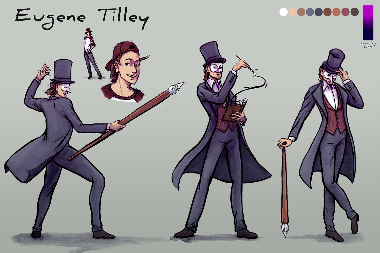
Second Test
I took out the corner logo because it wasn’t needed. I moved the text out of illustrator to the Photoshop file so I could apply the texture to it. I made a majority of the image darker to make it creepier.

Final
Those level adjustments and saturation were too much, so I toned down the colors.